Create Appearance-compatible custom CSS and Themes
This page is a work-in-progress for Bloom 6.0. Information subject to change.
Please see this page for a more introductory explanation of the Bloom Appearance system: The Appearance System
This is a very technical note, intended only for Publishers with technical staff.
How the Appearance System works
Each Theme is a CSS file that sets the value of one or more Appearance properties.
Each book has an appearance.json file that can contain the same set of properties in JSON form. It also includes a property to indicate the currently selected theme.
As you customize settings in the “Book Settings” dialog, Bloom updates that appearance.json. Note that the user interface only shows a small number of available Appearance settings. Instead, most settings are controlled by the theme that you choose.
When Bloom displays a book, it converts that appearance.json and the chosen theme into a CSS file named appearance.css.
The HTML page then applies these stylesheets in this order (last wins, all other things being equal):
basePage.cssorbasePage-legacy.cssappearance.csscustomBookStyles.css,customBookStyles2.css
Precedence
A challenge in modern Bloom is that there are a number of things that each influence the final display of a page. These things may even be wanting opposite things to happen. What happens if the Book Settings Dialog is used to turn something on, but a custom css is used to turn it off? Who wins?
Since ultimately CSS is involved, the answer is complicated by CSS specificity rules. But given the same specificity, here is the order of precedence for the various sources ( >> here means “has precedence over”):
xmatter HTML >> customBookStyles.css >> xmatter.json >> branding.json (.appearance) >> Book Settings (appearance.json) >> Theme (foobar.css)
Why is xMatter pug the ultimate winner? This is because, if an xMatter doesn’t have an HTML element for something, it can’t be CSS’ed or JSON’ed into existence.
Notice that Theme’s position in the list. Not only is it last, but actually any property that appears in Book Settings will win over that described in the Theme, unless CSS specificity rules cause it to overcome the Book Settings.
Avoid putting things in a theme that are also part of Book Settings. Be aware that in a future version, a given property may become available in Book Settings and therefore will override that setting in an older theme, unless we create a value for the Book Settings control that means “I don’t care”. Such a value is likely for things like page-background-color.
Creating a new Theme
If you cannot get what you need using the Book Settings UI or by choosing a theme, first, talk to us. We may advise a different solution, or we may direct you to use the following directions.
If it doesn’t already exist, create a customBookStyles.css in the root of the book folder. Use an editor that understands CSS will show you any errors. We highly recommend Visual Studio Code (it is free). The basic template is:
.bloom-page {
 /* set properties here*/
}
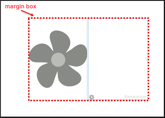
For example, imagine that we want to draw a dashed red box around the “Margin Box”
.bloom-page {
    --marginBox-border-style: dashed;
    --marginBox-border-color: red;
}
What if we need something special in Device16x9Portrait versions of the book? For this, we add a rule group that selects for that:
/* default */
.bloom-page {
    --marginBox-border-style: dashed;
    --marginBox-border-color: red;
}
.Device16x9Portrait {
    --marginBox-border-style: solid;
}
If you set a variable that is a dimension, like --page-margin or --page-gutter, it must have some unit, such as px or em or mm or in. Contrary to usual CSS advice, you must give a unit even if setting the variable to zero. Although it seems redundant (0px = 0em = 0mm = 0in), the browser fails when doing any arithmetic with variables that are supposed to be dimensions but lack a unit, so setting such a variable to zero can have unexpected results that are difficult to diagnose, such as rules that appear to apply but don’t do anything.
We are trying to standardize on mm as the unit for measurements that should not related to font size, and em for ones that should. Following this convention may help with future compatibility if we add a UI control for the variable you are using.
As before, it is still possible to write arbitrary CSS rules based on what you find in Bloom HTML. However, we really need to move away from that practice. Instead:
Before writing CSS rules that use anything other than the official Appearance properties, please consider asking us to add an Appearance property for what you are trying to do. This will lead to a more sustainable Bloom ecosystem.
Problems with unconstrained “custom CSS” For a long time, highly technical Bloom users have been able to go “under the hood” to make tweaks to page layout and styling using the Web’s “Cascading Style Sheets” (CSS) language. This system is useful as a last resort, but it has several problems, including:
We find that many of the custom CSS files in books uploaded to BloomLibrary.org are actually riddled with errors, indicating that this feature is being used by organizations that lack the tools or expertise to do it properly.
It is difficult for us to add friendly UI controls over settings that compete with settings that may be in the custom CSS files.
CSS rules often depend on how we implemented lower-level Bloom CSS and page HTML. This reliance prevents us from improving Bloom with simpler or more modern approaches.
Appearance Properties
| Variable Name | TODO: Changes to names nouns camelCase dimensions separated by dashes mostGeneral-moreSpecfic-even-moreSpecific-property We decided to use natural property names, so “horizontal-gap” instead of “gap-horizontal” | Use Restrictions | Description | In Themes and Custom CSS | In Book Settings UI |
|---|---|---|---|---|---|
| --cover-margin-bottom | ⚠️Themes should not try to change cover pages— else users may have a confusing clash with xmatter, branding, and book settings customizations. | padding-bottom value for outside front and back cover pages. [default is 12mm] | 6.0 | ||
| --cover-margin-top | padding-top value for outside front and back cover pages. [default is 12mm] | 6.0 | |||
| --coverShowLanguageName | --cover-languageName-show | ⚠️Themes should not try to change cover pages— else users may have a confusing clash with xmatter, branding, and book settings customizations. | display value for the language name on the front cover (none to hide or inline-block to display in a default manner). [default is inline-block, a keyword] | 6.0 | |
| --coverShowTitleL2 | --cover-title-L2-show | ⚠️Themes should not try to change cover pages— else users may have a confusing clash with xmatter, branding, and book settings customizations. | display value for the Language 2 title on the front cover (none to hide or block to display in a default manner). [default is block, a keyword] | 6.0 | |
| --coverShowTitleL3 | --cover-title-L3-show | ⚠️Themes should not try to change cover pages— else users may have a confusing clash with xmatter, branding, and book settings customizations. | display value for the Language 3 title on the front cover (none to hide or block to display in a default manner). [default is none, a keyword] | 6.0 | |
| --coverShowTopic | --cover-topic-show | ⚠️Themes should not try to change cover pages— else users may have a confusing clash with xmatter, branding, and book settings customizations. | display value for the topic on the front cover (none to hide or inline-block to display in a default manner) [default is inline-block, a keyword] | 6.0 | |
| --cover-creditsRow-show | ⚠️Themes should not try to change cover pages— else users may have a confusing clash with xmatter, branding, and book settings customizations. | display value for the credits on the front cover (none, a keyword, to hide) [default is to show] | |||
| --cover-background-color | 6.1 | 6.1 | |||
| --image-border-radius | border-radius for images added by the user to the front cover or to a content page https://developer.mozilla.org/en-US/docs/Web/CSS/border-radius) | 6.0 | |||
| --marginBox-background-color | background-color for content on numbered pages, including behind text boxes, between text boxes, behind partially transparent pictures, and between text boxes and pictures. [default is transparent] | 6.0 | |||
| --marginBox-border-color | border-color for borders around text boxes on numbered pages. [default is black] | 6.0 | |||
| --marginBox-border-radius | border-radius for borders around text boxes on numbered pages. [default is 0px, for square corner] | 6.0 | |||
| --marginBox-border-style | border-style for borders around text boxes on numbered pages (typical values include solid, dashed, dotted, and none). [default is none, a keyword, to hide the border] | 6.0 | |||
| --marginBox-border-width | border-width for user text boxes on numbered pages (typical values include 3px, 1mm, thin, medium, or thick). [default is medium] | 6.0 | |||
| --marginBox-padding | padding for text boxes on numbered pages. [default is 0px] | 6.0 | |||
| --multilingual-editable-vertical-gap | The space between the different language sections of each block when Bloom is configured to show each block of text in more than one language. [default is 10px] | 6.0 | |||
| --page-background-color | background-color for the full content of all pages. [default is _white]_ | 6.0 | |||
| --page-gutter | additional inner margin for pages of a book. [default is 0mm since most Bloom books are too small to need a gutter, or are published as e-books that inherently don’t need a gutter] | 6.0 | |||
| --page-margin | margin for all pages. Aspects can be overriden by the more specific --page-margin- and —cover-margin- properties. | 6.0 | |||
| --page-margin-bottom | padding-bottom for inner pages, i.e., not outside cover pages, but including inside cover pages. [default is 12mm] | 6.0 | |||
| --page-margin-left | basic padding-left for all pages. It is added to --page-gutter for left-side pages. Also used for padding-right for pages which are inherently symmetrical left vs right. These include outside cover pages, calendar pages, Device16x9… sized pages, etc. [default is 12mm] | 6.0 | |||
| --page-margin-right | basic padding-right for all pages. It is added to --page-gutter for right-side pages. [default is 12mm] | 6.0 | |||
| --page-margin-top | padding-top for inner pages, i.e., not outside cover pages, but including inside cover pages. [default is 12mm] | 6.0 | |||
| --page-horizontalSplit-height | padding-top for the lower section when a page is split horizontally into upper and lower sections. [default is 3px, chosen conservatively to match what 5.6 had… could easily argue for 0] Normally it’s better to use --text-padding instead. | 6.0 | |||
| --page-verticalSplit-width | padding-left for the right-hand section when a page is split vertically into left and right sections. [default is 3px] | 6.0 | |||
| --pageNumber-always-left-margin | left value for displaying page numbers on right side pages. This is the distance between the left edge of the page and the page number. This allows page number to always be on the left, regardless of page side. The auto keyword works for this value, but nothing works unless --pageNumber-right-margin is set to the unset keyword. If this is used, --pageNumber-right-margin must be set to unset, a keyword. [default is unset, a keyword] | 6.0 | |||
| --pageNumber-background-color | background-color for displaying the page number. [default is transparent] | 6.0 | |||
| --pageNumber-background-width | used for both height and width in displaying the page number. This setting usually doesn’t matter unless --pageNumber-background-color is set to something other than transparent. [default is unset, a keyword] | 6.0 | |||
| --pageNumber-border-radius | border-radius for displaying the page number. This usually doesn’t matter unless --pageNumber-background-color is set to something other than transparent. [default is 0px, producing square corners] | 6.0 | |||
| --pageNumber-bottom | bottom value for displaying the page number. This is the distance between the bottom of the number and the bottom of the page. Either --pageNumber-bottom or --pageNumber-top should be set to a length value, and the other set to unset, a keyword. [default is 10px] | 6.0 | |||
| --pageNumber-font-size | font-size for displaying the page number. This can be expressed exactly as in the default value, or using units of em for sizes relative to the parent element or rem for sizes relative to the body element. If not set, the body element defaults to a font size of 16px. In this case, 1.1666667rem would roughly equal 14pt for the standard 96dpi screen. If the body font-size is 10pt, then 1.4rem would equal 14pt. [default is 14pt] | 6.0 | |||
| --pageNumber-left-margin | left value for displaying page numbers on left side pages. This is the distance between the left edge of the page and the page number. The auto keyword works for this value. [default is auto, a keyword] | 6.0 | |||
| --pageNumber-right-margin | right value for displaying page numbers on right side pages. This is the distance between the right edge of the page and the page number. If this is used, --pageNumber-always-left-margin should be set to unset, a keyword. The auto keyword does not work for this value. [default is var(--page-margin-right), which makes it the same as the current value of --page-margin-right] | 6.0 | |||
| --pageNumber-show | CSS display value for the page number. The default is to show the page number on numbered pages. Set to none (a keyword) to hide the page numbers. | ||||
| --pageNumber-top | top for displaying the page number. This is the distance between the top of the number and the top of the page. Either --pageNumber-bottom or --pageNumber-top should be set to a length value, and the other set to unset, a keyword. [default is unset, a keyword] | 6.0 | |||
| -pageNumber-extra-height | How much should the marginBox shrink to leave room for the page number? | ||||
| TODO: Add this -textOverPicture-padding See BL-12948 | |||||
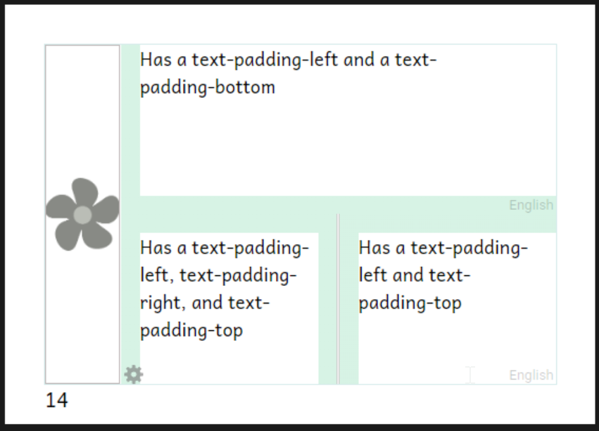
| --topLevel-text-padding | Only applies to boxes boxes that aren’t nested inside other boxes. (This is so that it doesn’t interfered will little grid boxes, orgami-based dictionaries, etc.) [default is 1em. Therefore it grows with the size of the font.] See example screenshot below. Can override with the next 4 as needed. | 6.0 | 6.0 (a few choices) | ||
| --topLevel-text-padding-top | Space added at the top of a text when there is another box above it. [default is --text-padding-default] | 6.0 | |||
| --topLevel-text-padding-bottom | Space added at the bottom of a text when there is another box below it. [default is --text-padding-default] | 6.0 | |||
| --topLevel-text-padding-left | Space added at the left of a text when there is another box to the left of it. [default is --text-padding-default] | 6.0 | |||
| --topLevel-text-padding-right | Space added at the right of a text when there is another box to its right. [default is --text-padding-default] | 6.0 | |||
Examples
Selectors
Root Selector
| .bloom-page | This is the root that applies to every page. Use this instead of ::root which is normally recommended in CSS documentation. ::root will appear to work, but may fail Bloom Reader. |
Special Page Selectors
| .outsideFrontCover | |
|---|---|
| .insideFrontCover | |
| .titlePage | |
| .credits | |
| .insideBackCover | |
| .outsideBackCover |
Page Size / Layout Selectors
| .A5Portrait | |
|---|---|
| .A5Landscape | |
| A4Portrait | |
| A4Landscape | |
| A3Portrait | |
| A3Landscape | |
| B5Portrait | |
| LetterLandscape | |
| LetterPortrait | |
| HalfLetterPortrait | |
| HalfLetterLandscape | |
| QuarterLetterLandscape | |
| QuarterLetterPortrait | |
| Device16x9Portrait | |
| Device16x9Landscape | |
| A6Portrait | |
| A6Landscape | |
| Cm13Landscape | |
| USComicPortrait | |
| Size6x9Portrait | |
| Size6x9Portrait |
| .bloom-page[class*="Device"] | Apply only to Device layouts |
|---|---|
| .bloom-page:not([class*="Device"]) | Apply only to non-Device layouts |
| .bloom-page[class*="Landscape"] | Apply only to Landscape layouts |
| .bloom-page[class*="Portrait"] | Apply only to Portrait layouts |
Migrating old custom CSS
If you have existing customBookStyles.css files, here are some of the main considerations for moving to the Appearance system. First, just try opening your book in Bloom 6.0 (or later). Go to the book settings dialog and see whether the page theme is Default, Legacy (Bloom 5.6), or something else. If it’s something other than Legacy (Bloom 5.6), you’re lucky… we already did the migration for you. It would be good to check that you like the results and see if there’s anything you want to tweak, but you shouldn’t need to do any more, unless you want to clean up padding, as described in the release notes.
If you see “Legacy (Bloom 5.6)” then your book is, for the moment, stuck in the old days. It is using custom CSS that’s not compatible with the Appearance system. Some things in the Book Settings dialog are already disabled, and it’s likely that more new capabilities won’t work over time. We would encourage you to switch over.
The first thing to try is just to change the theme to Default. (You could also try some of the others.) This will disable your custom CSS and give you one of the new layouts. One of them might be close enough, especially if you make use of the new Book Settings! Then you can just discard your custom CSS. (Or if you or colleagues are still using 5.6 to work on this book, you may want to keep it until 6.0 moves from Beta to Release.)
If you still want custom CSS, we encourage you to see what you can do by setting the variables described above. If you want to do something that can’t be done with them, we’d like to know about it… maybe we can add some more variables.
In particular, books get locked into the legacy theme mainly if their customBookStyles.css sets the position and size of the margin box. You can replace such rules using the Appearance system… usually much more easily. For example, if you want just 2mm of margin around your page, and 5mm more on the bottom to show page numbers, in the old system you’d need something like
.Device16x9Portrait .marginBox {
    top: 2mm;
    left: 2mm;
    width: ?mm; /* width of a Device16x9 portrait page minus 4mm */
    height: ?mm; /* height of a Device16x9 portrait page minus 9mm */
}
/* and maybe */
.Device16x9Portrait.titlePage,
.Device16x9Portrait.creditgsPage {
    height: ?mm; /* height of a Device16x9 portrait page minus 4mm, not leaving room for page number */
}
.A5Portrait .marginBox {
    /* ...needs different width and height for a different page size */
}

/* And similarly for any other page sizes you care about */
In the Appearance system, you can just do
.bloom-page {
    --page-margin: 2mm;
    --pageNumber-extra-height: 5mm;
}

/* if you want a bigger margin on A4 you can do it, but the above will work for all sizes where you want 2mm. */
You could also set --page-margin-bottom to 7mm, but the above is better: it will do the right thing on pages that don’t have numbers and if you use book settings to turn off page numbers.
Other things like padding don’t have to be changed; but see Bloom 6.0 Release Notes for how padding has been improved and may make awkward ways of doing things unnecessary. The more you can do with the documented variables, the better your chances for compatibility with future Bloom versions and features.